This Project won a Silver Student Addy Award for Campaign Development in 2023
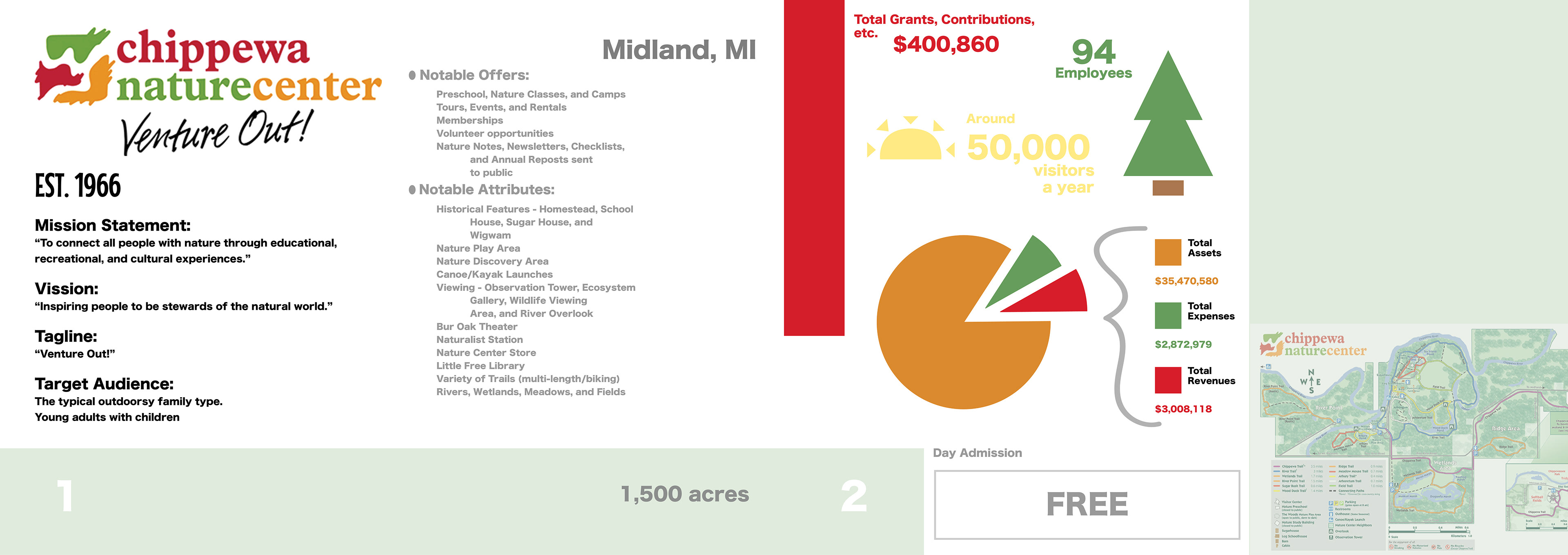
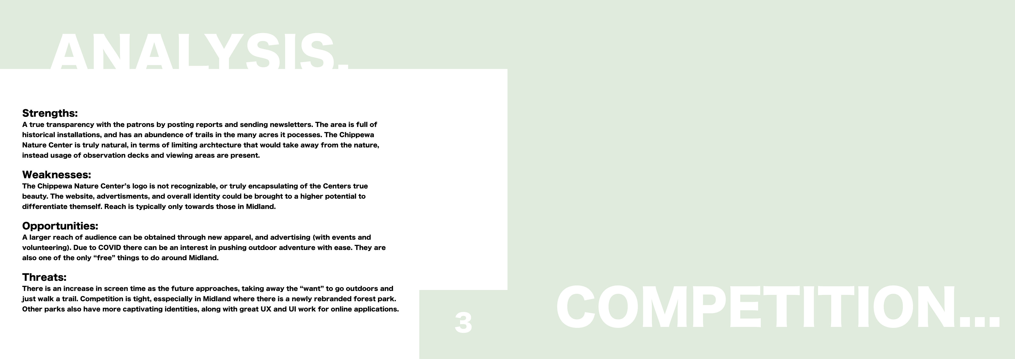
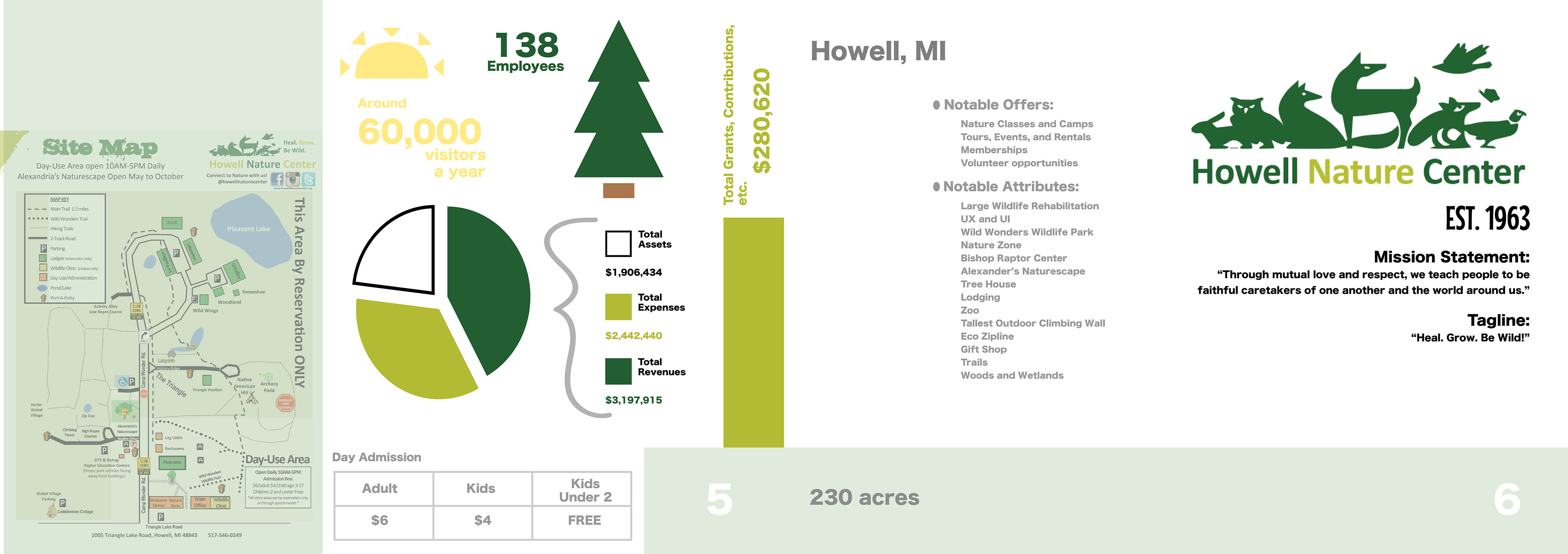
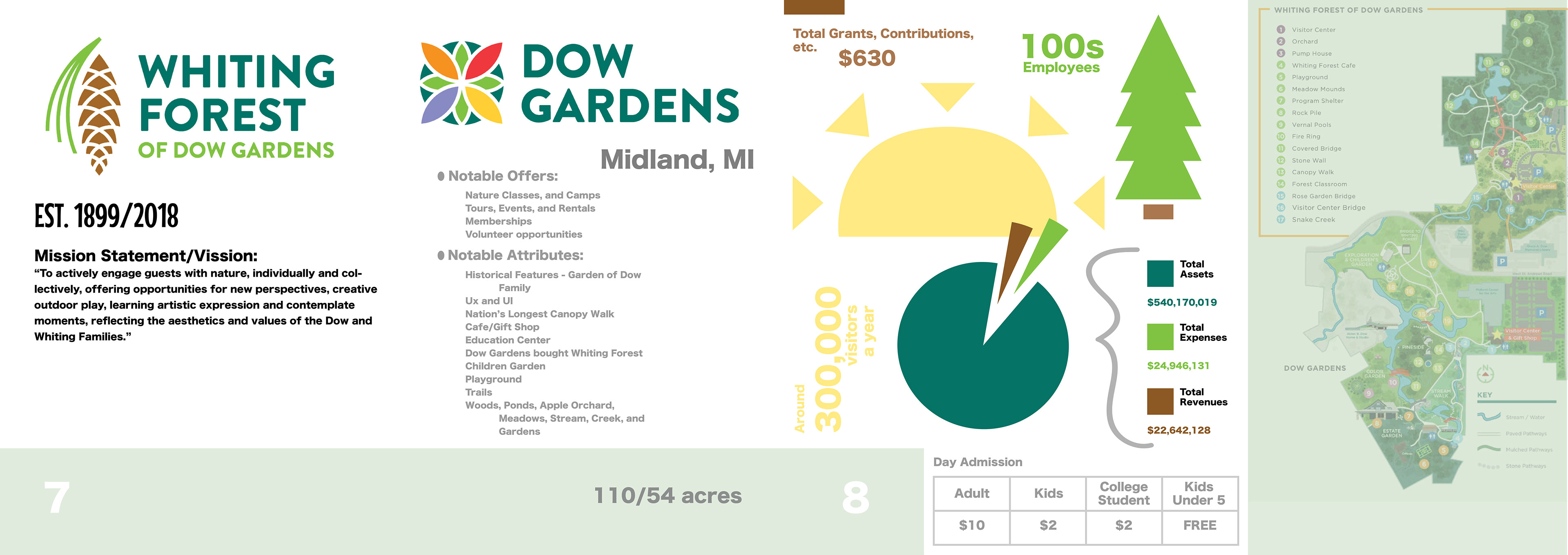
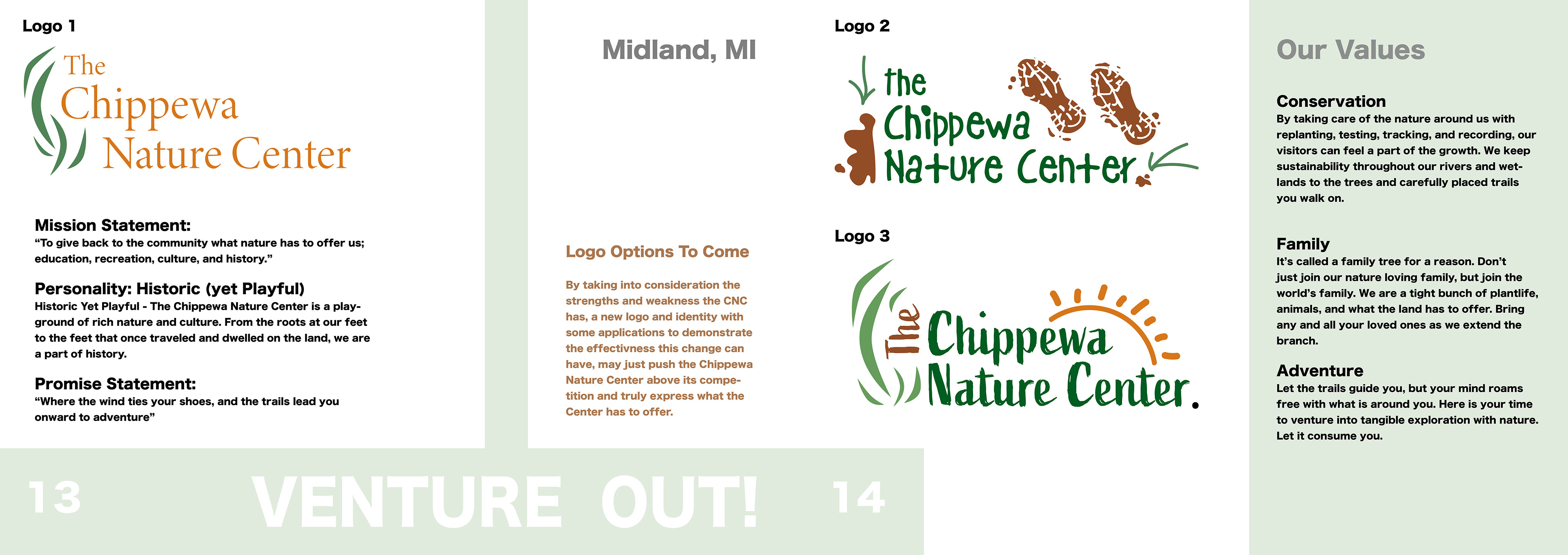
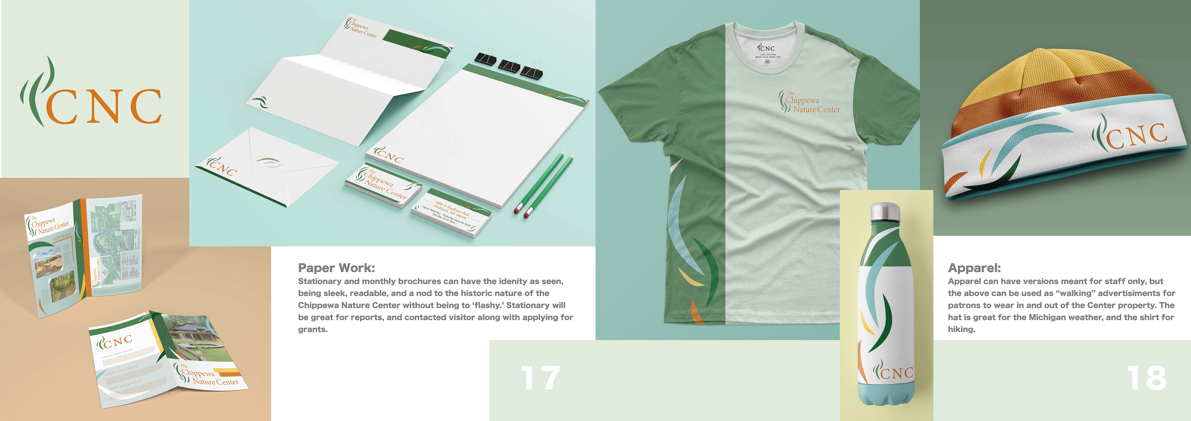
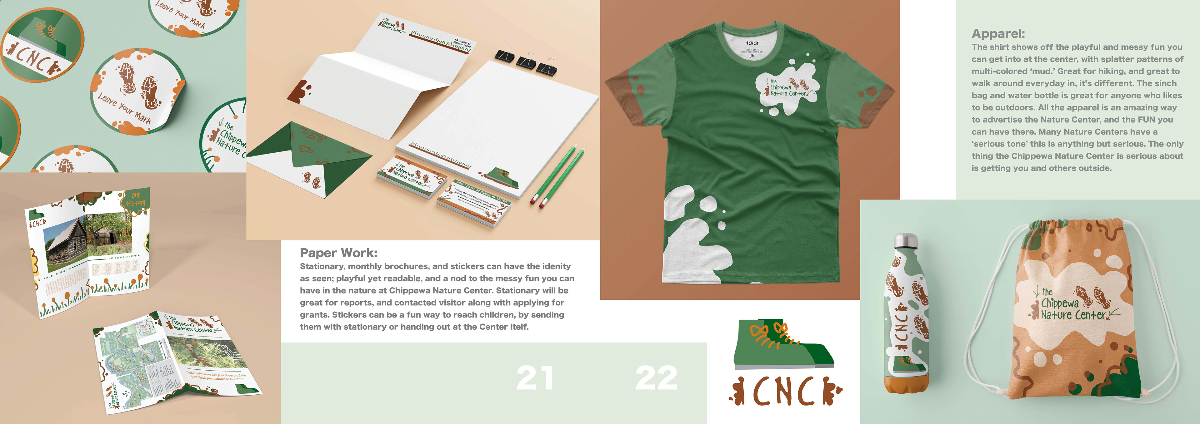
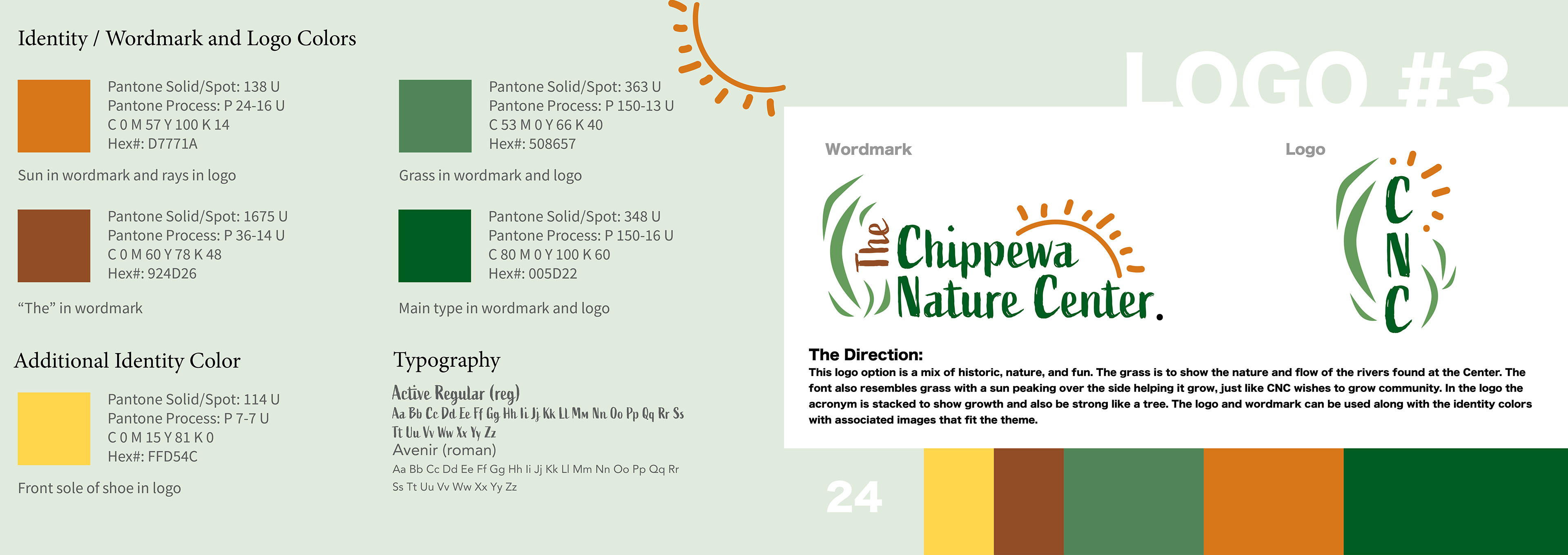
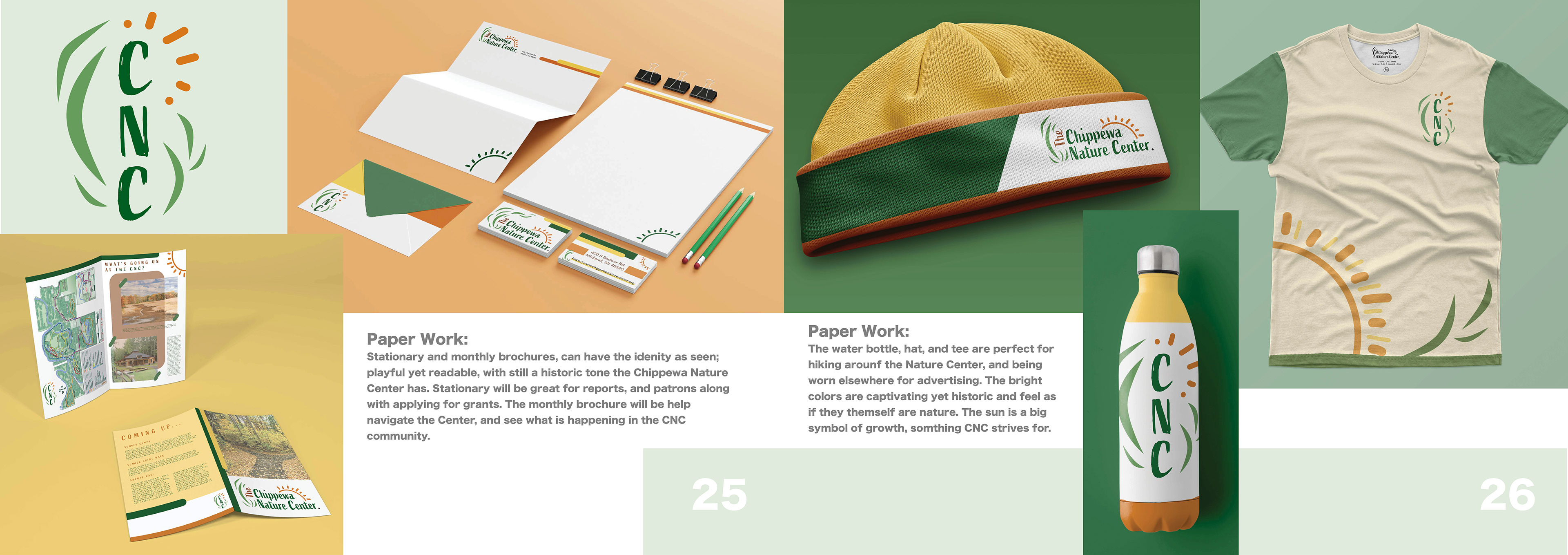
This campaign was a fantasy redesign of a nature center I commonly visited as a child. The project included making an entirely new logo and identity for an existing business. After mass amounts of research a booklet was made to propose three options as if given to the client to chose from. From the three ideas I chose logo 1, which most aligned with the target audience and overall "feel" the Chippewa Nature Center provides to the community.
- Illustrator - Photoshop - InDesign -
Assets of apparel, website, and printed identity.
Wayfinding examples for the CNC along with additional signage.
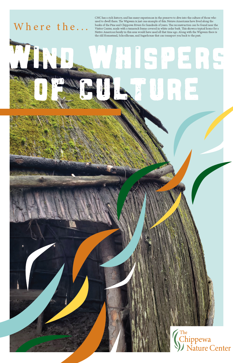
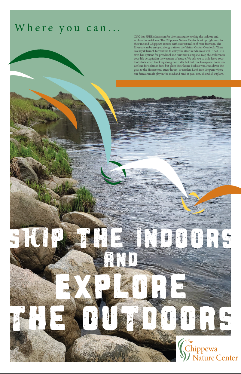
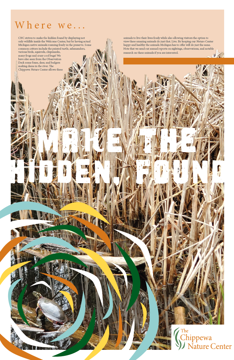
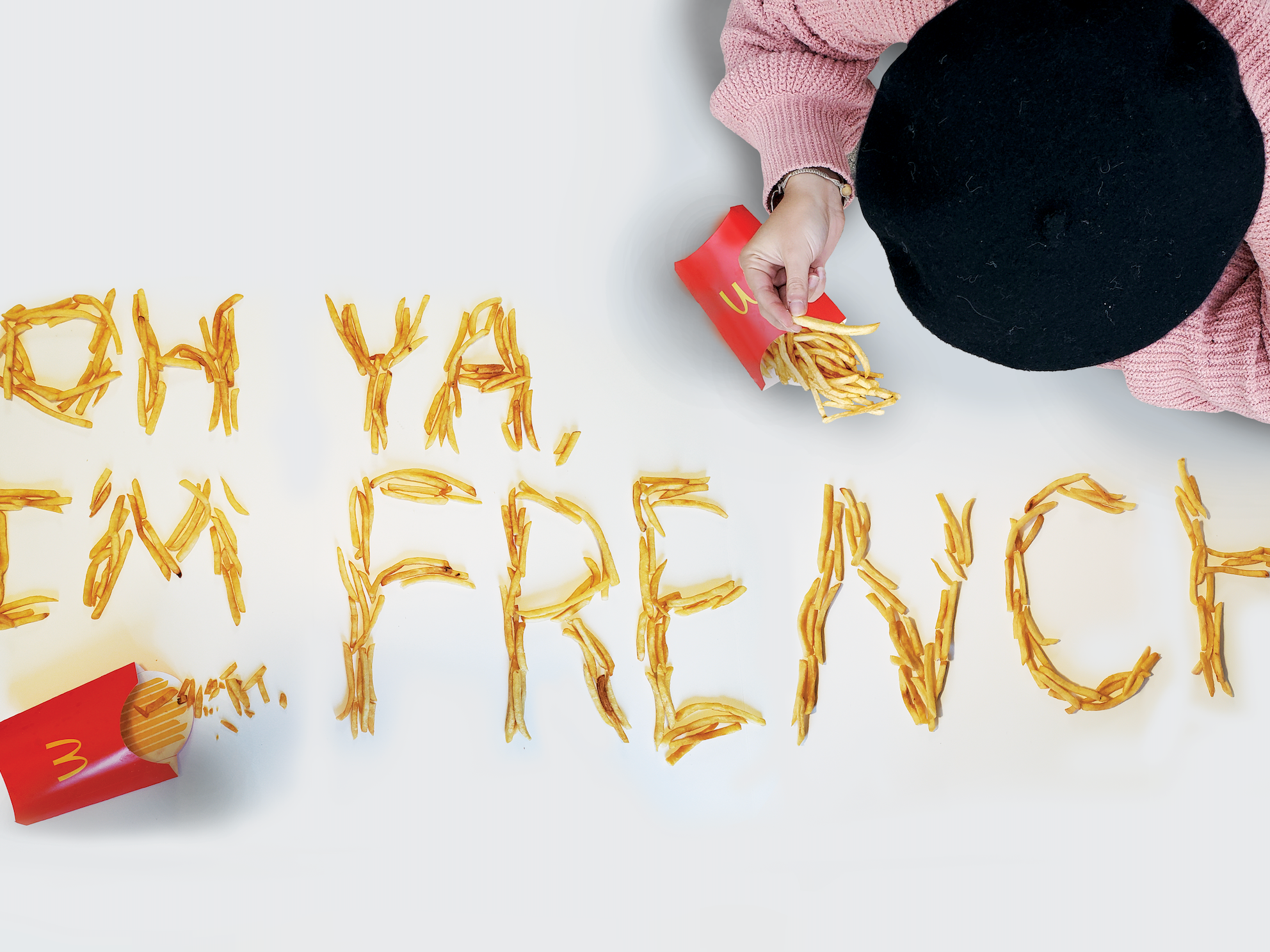
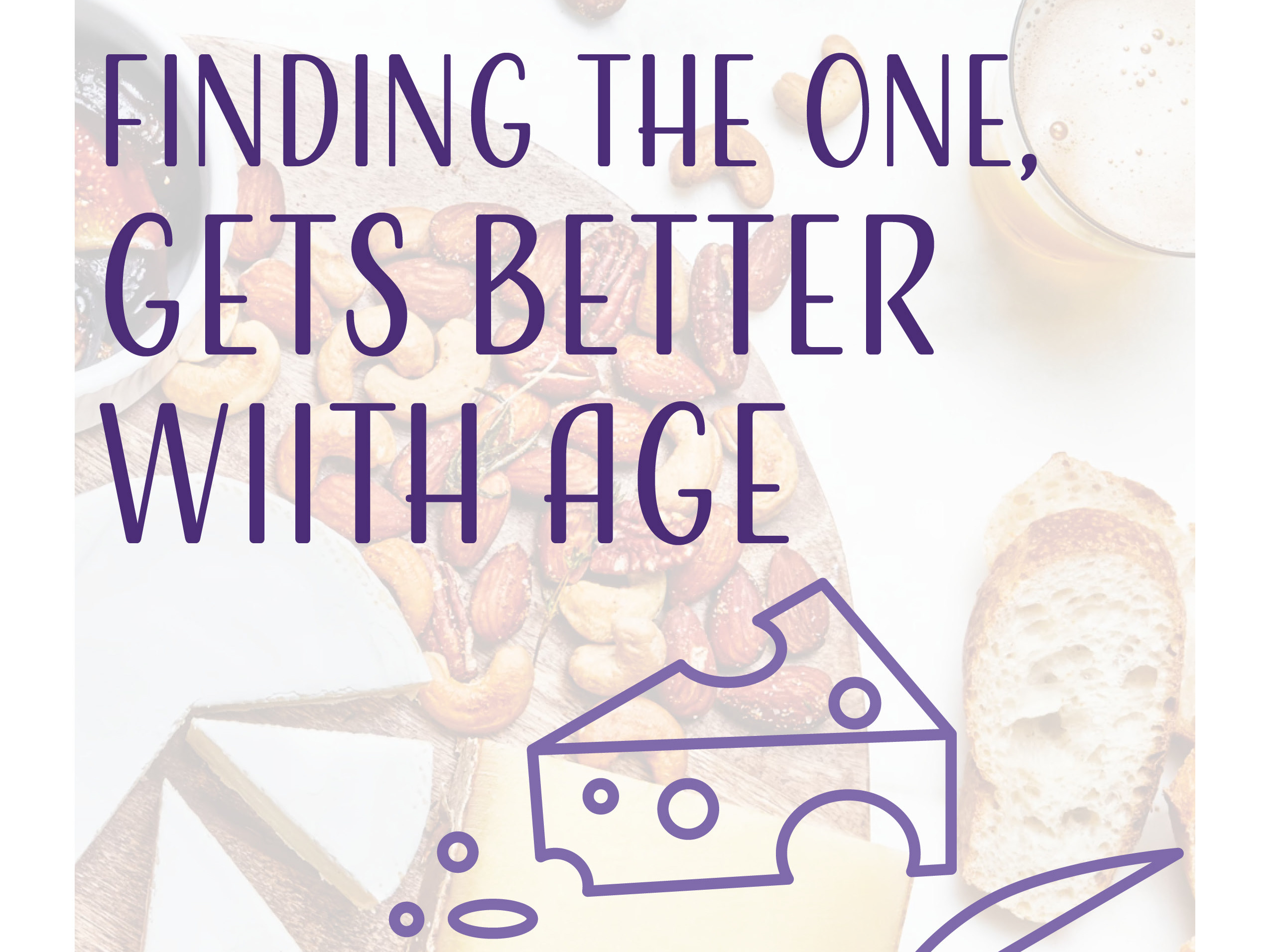
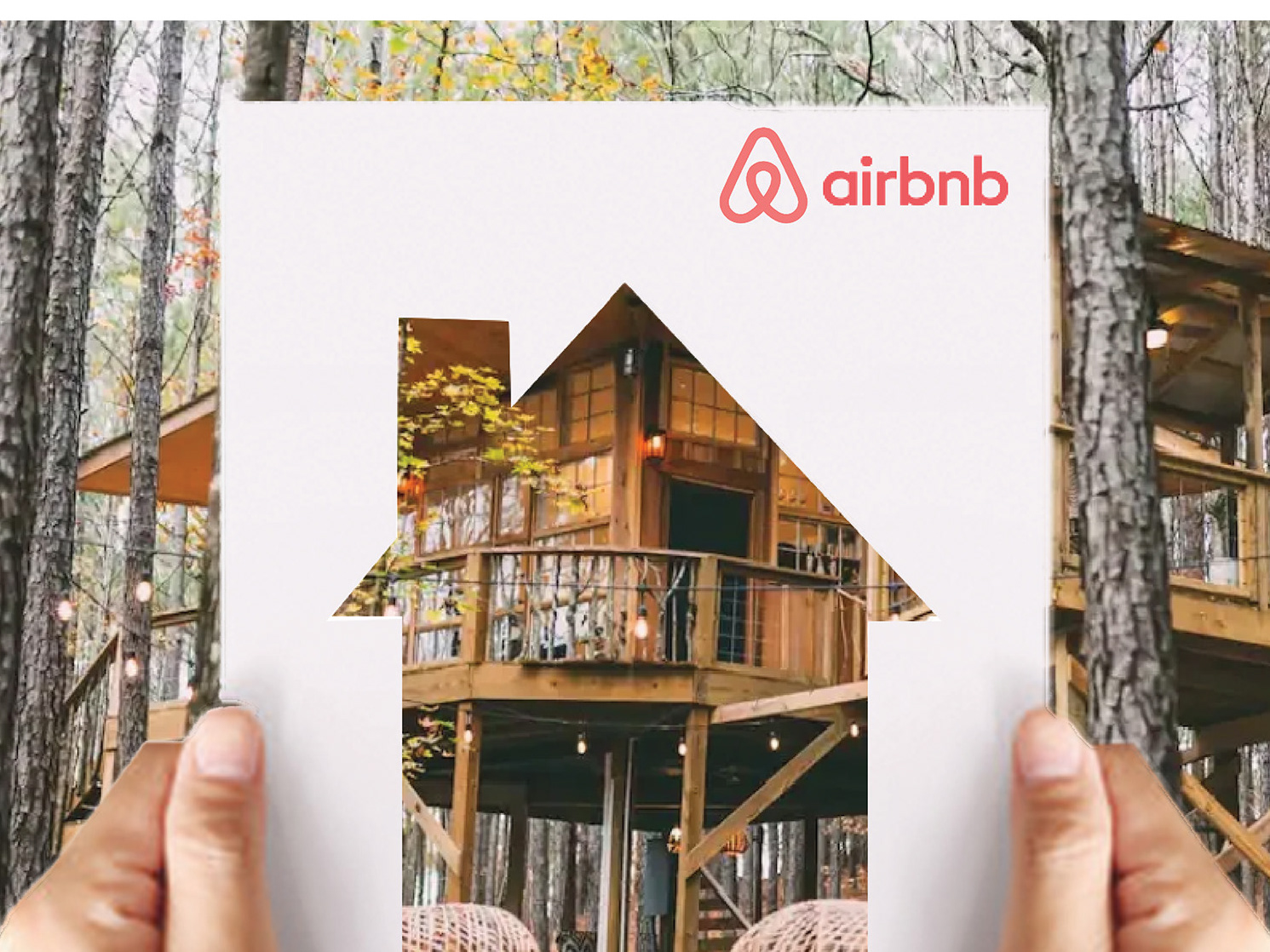
Poster campaign aligning with the three main views of the identity/redesign:
culture, adventure, and nature
culture, adventure, and nature
The booklet explaining all research done to come up with three logo/identities along with competition analysis.

